Thanks to the folks at Statista, we know that more than half of all website traffic these days comes from mobile devices, up from less than a third just seven years ago. That number is only going to continue to rise as mobile web speeds climb and more folks transition to mobile devices.
This means it’s obviously important to make sure that your website loads quickly across all devices (see my overview on the huge Google core web vitals update from 2021).
And THIS in turn means that it’s not enough to put together one iteration of your site and call it a day.
Enter AMP, so let’s talk about what is AMP in WordPress and how to speed up a WordPress site on mobile using it.
What is AMP in WordPress?

In short, AMP stands for accelerated mobile pages and essentially means creating dedicated mobile friendly pages which will load on mobile devices in place of your conventional pages.
Not surprisingly, AMP was an open-source project initiative started by Google. Google wants to feature fast loading pages in its SERPs regardless of the device someone is using.
When someone is on a mobile device, odds are greater that their internet connection will be slower and less reliable than when browsing on a desktop.
AMP takes this into consideration and creates specific pages which load more quickly. It accomplishes this by putting caps on the amount of JS and CSS code an AMP specific page can load (50kb).
It’s essentially a “lite” version of the same content designed entirely with speed in mind.

How to Speed Up a WordPress Site on Mobile With AMP
So how do we enable AMP on our website?
Like with everything in WordPress, there’s a simple plugin for enacting AMP on your website. There are a few good ones, so pick, install, and activate one on your site. I’ll be referencing AMP (literally the name of the specific plugin) in the rest of this resource.
You can see the plugin immediately start working if you begin creating a new post or page on your site or open an older one in your WP dashboard.
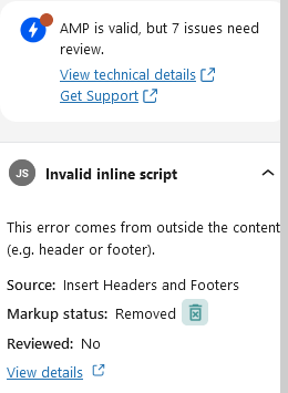
In the case of AMP the plugin, you can see live AMP validation on the right hand of the screen when you click on the AMP bolt icon:

In the case of this page, there are 7 issues which means there are 7 elements on the page which, if left intact, the page will NOT have AMP validation. This means that Google will not see that we have an AMP compliant page to serve to mobile users.
By default, this plugin removes the sections of a page which are keeping it from being AMP compliant. Note that this doesn’t affect your original/desktop version one iota.
So by default, no extra actions are needed on your end. That said, it’s still useful for seeing any issues which were note AMP compliant and possibly are slowing your site down in general.
To be clear, unless there are specific issues the plugin will notify you about where you need to take manual action, you’ll have an AMP ready/mobile Google friendly page every time which can help you outrank your competitors in Google’s mobile SERPs.
Alternatively, the plugin allows you to manually create a dedicated AMP version of the page separate of your main page. You might go for this option if you have a smaller site, say for a brick and mortar business which only has a few pages.
If you have a content site which you publish to frequently, the automated/standard version works well.
How to Not Sacrifice Style for Speed
The one obvious drawback of AMP is that it neuters the intended design of your page.
On some sites, if you’ve got a lot of code, it completely changes the look of the mobile pages so that it looks like you’re on a completely different website than the desktop version.
The best way to combat this is to have a light and speedy site to begin with so that there’s not much to change.
Incidentally, I just looked into what is the best free WordPress theme. Reassuringly (considering it’s the theme powering this), I found Astra to be the best free theme for a number of reasons, one of which is speed.
Astra boasts it’s AMP friendliness and compatibility in that it goes out of its way to keep your AMP pages as close to the desktop versions as possible. It accomplishes a lot of this by being lightweight right out of the box.
You can get an on-demand speed appraisal for both the desktop and mobile devices from Google to see how far behind the curve you are from the start. That free tool will give you recommendations on the biggest issues impacting your site’s speed and performance.
Some of the same issues may present themselves in the AMP validation section of a page. Of course with AMP installed, it simply removes the bits which are keeping it from being validated on its AMP version.
In Summary on How to Speed Up a WordPress Site on Mobile
- More than half of all website traffic is mobile and it will continue trending that way.
- It’s essential to have a website which is responsive on both desktop and mobile devices.
- AMP is a system of creating mobile friendly/lite versions of the same desktop content, optimized for mobile devices and designed to use less data/load quicker through data caps and other requirements.
- AMP pages are more Google friendly in Google’s mobile SERPs because Google recognizes that they load faster. As such, with everything else being equal, an AMP version of a page will outrank a conventional page which hasn’t taken mobile into consideration.
- Using a free AMP themed plugin, you can automatically create AMP compliant pages alongside the main content as you go. Conversely you can also use it to manually create an AMP compliant version of a page.
Hopefully this helped you understand more about AMP, why it can be beneficial for your site/rankings/traffic, and how easy it is to implement.

Pingback: The Top 10 Ways How to Increase Website Speed - WordPress Edition - Angry SEOer